Bass Lofts
Hold Fast to the Spirit of Youth
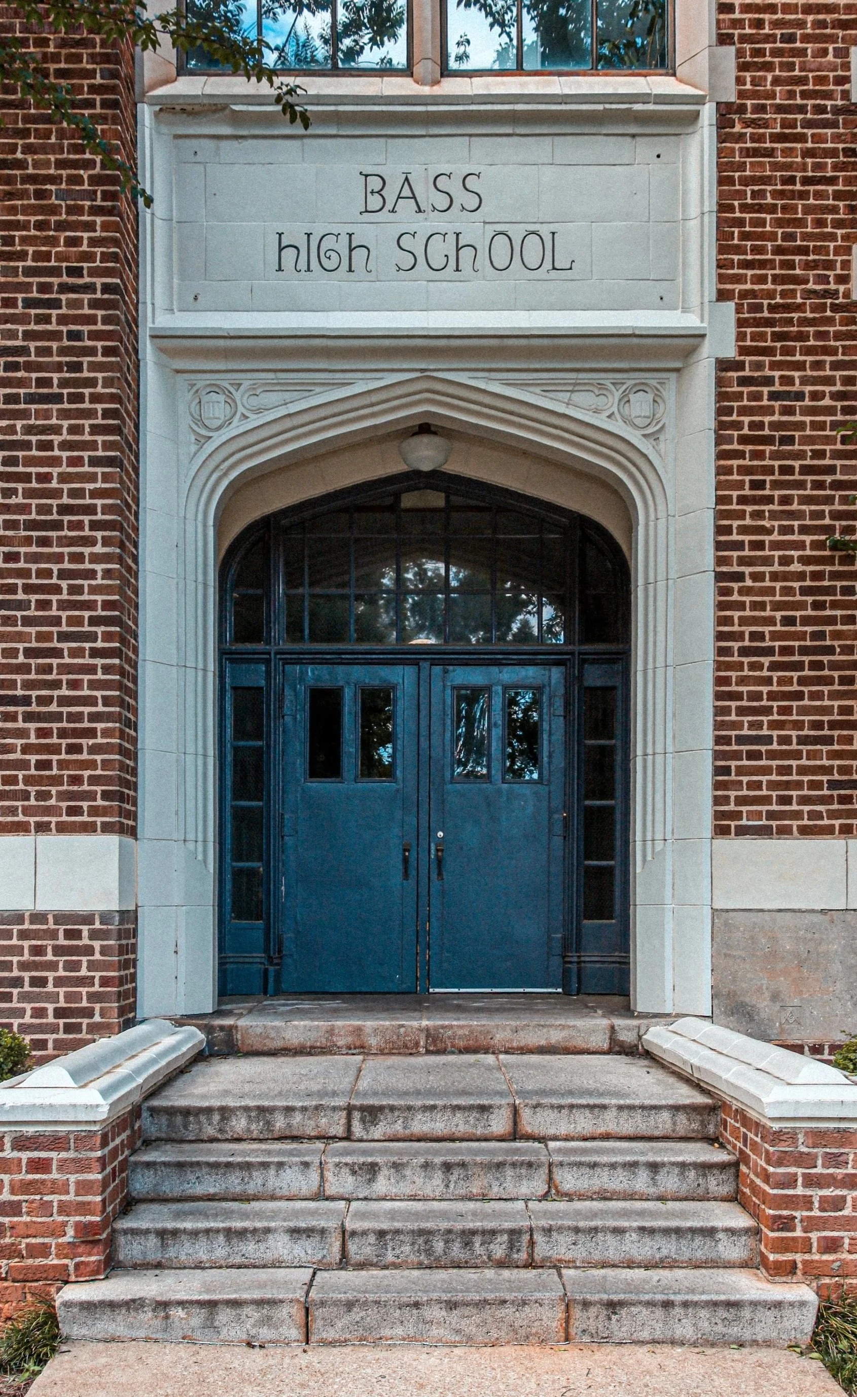
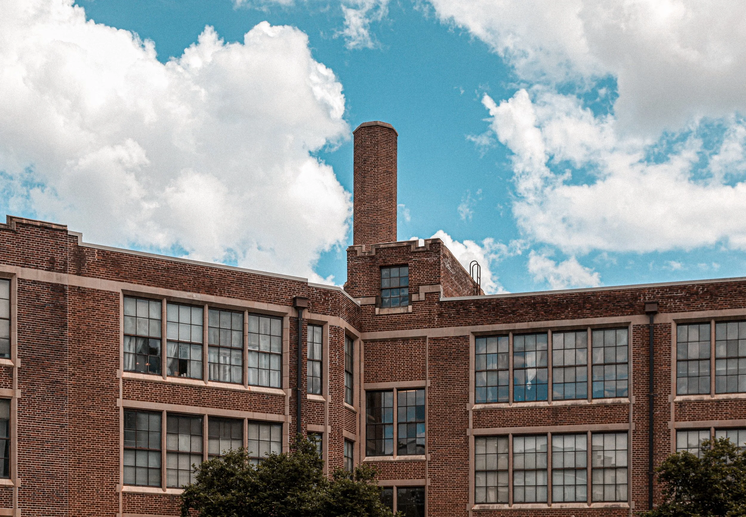
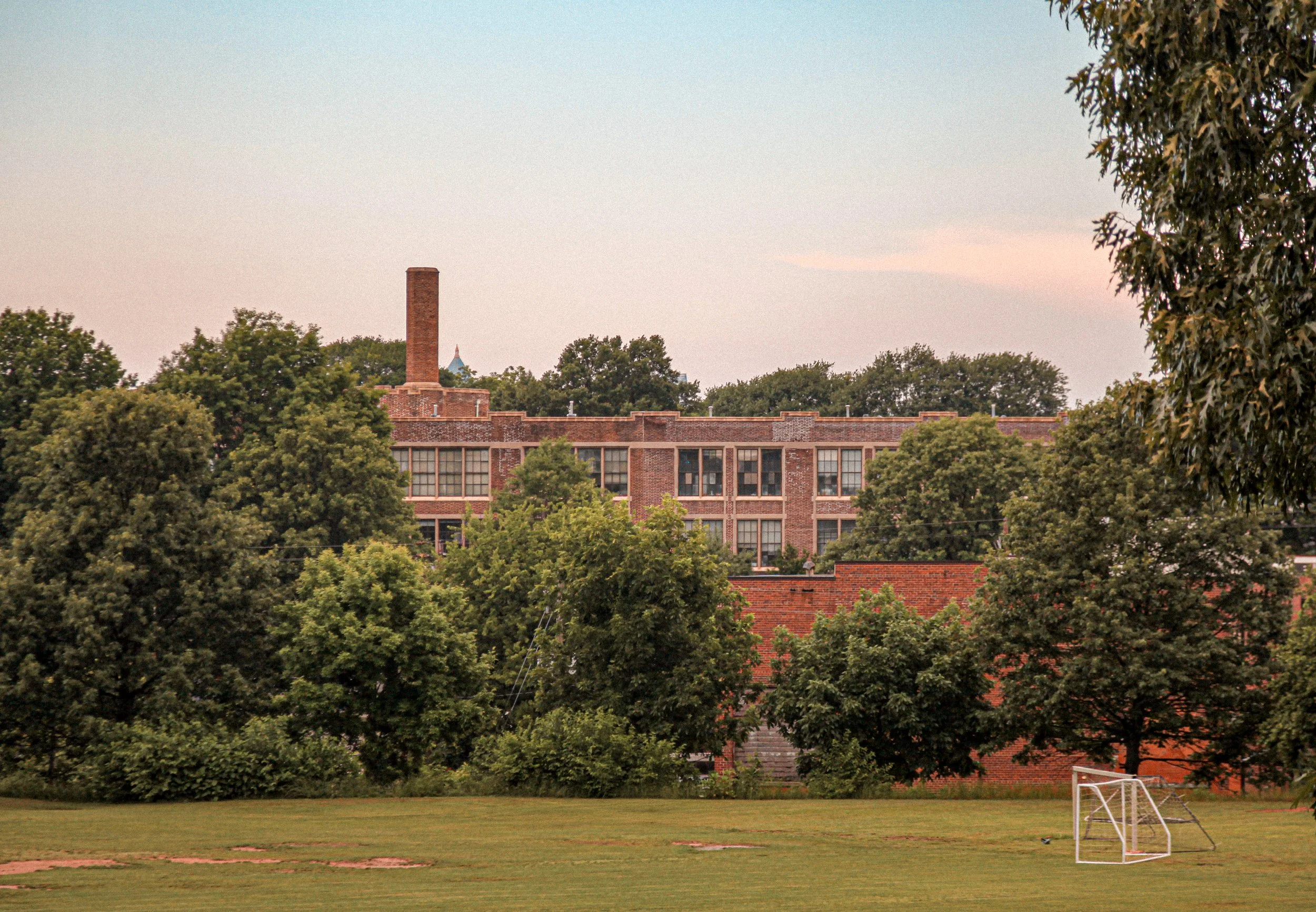
Listed on the National Register of Historic Places, Bass Lofts in Atlanta reimagines a 1920s junior high school as studio, one-bedroom, and two-bedroom loft apartments filled with character. Soaring ceilings, exposed brick, oversized windows, and preserved architectural details made this one of those projects where the building itself does most of the talking.
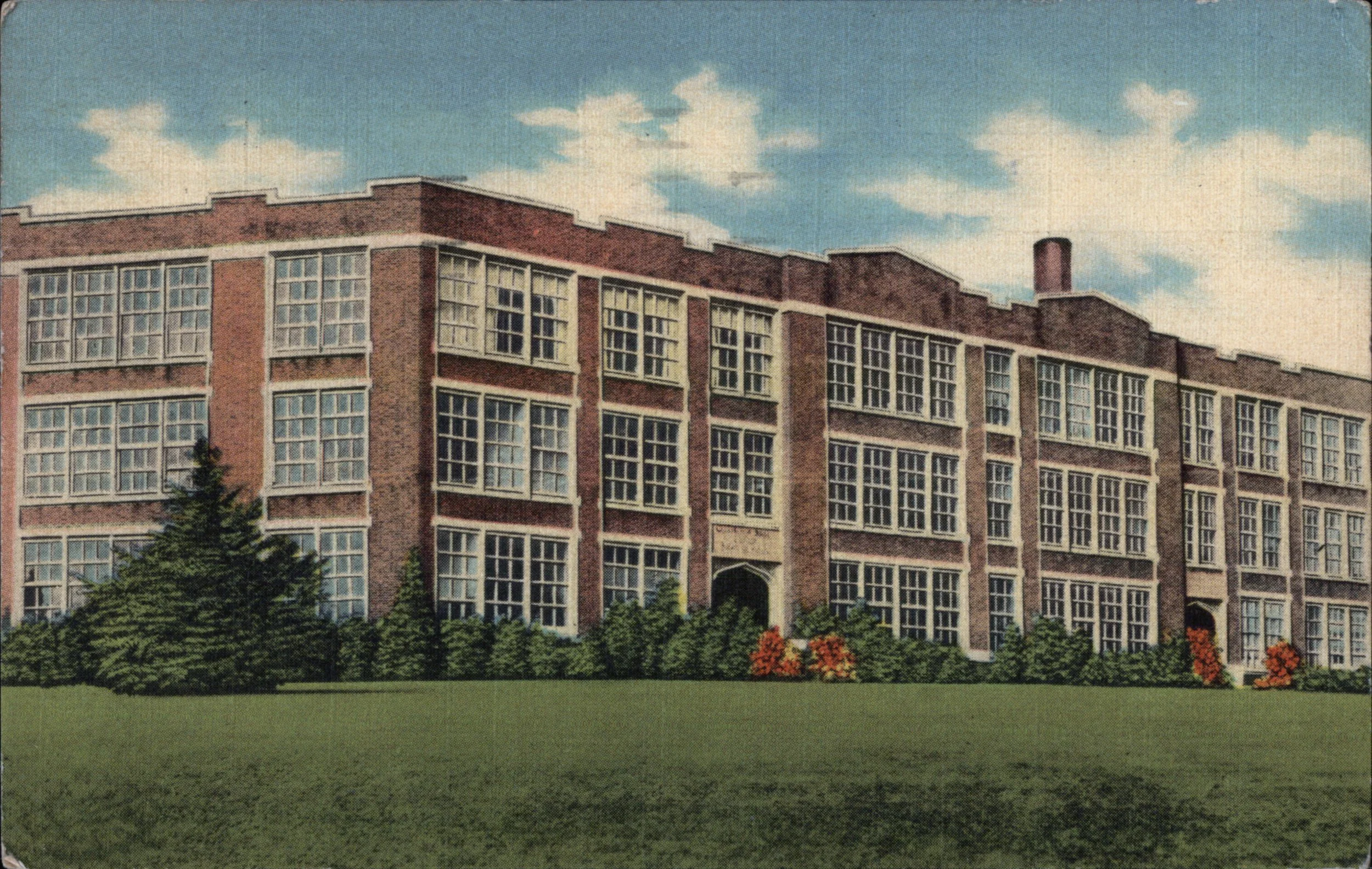
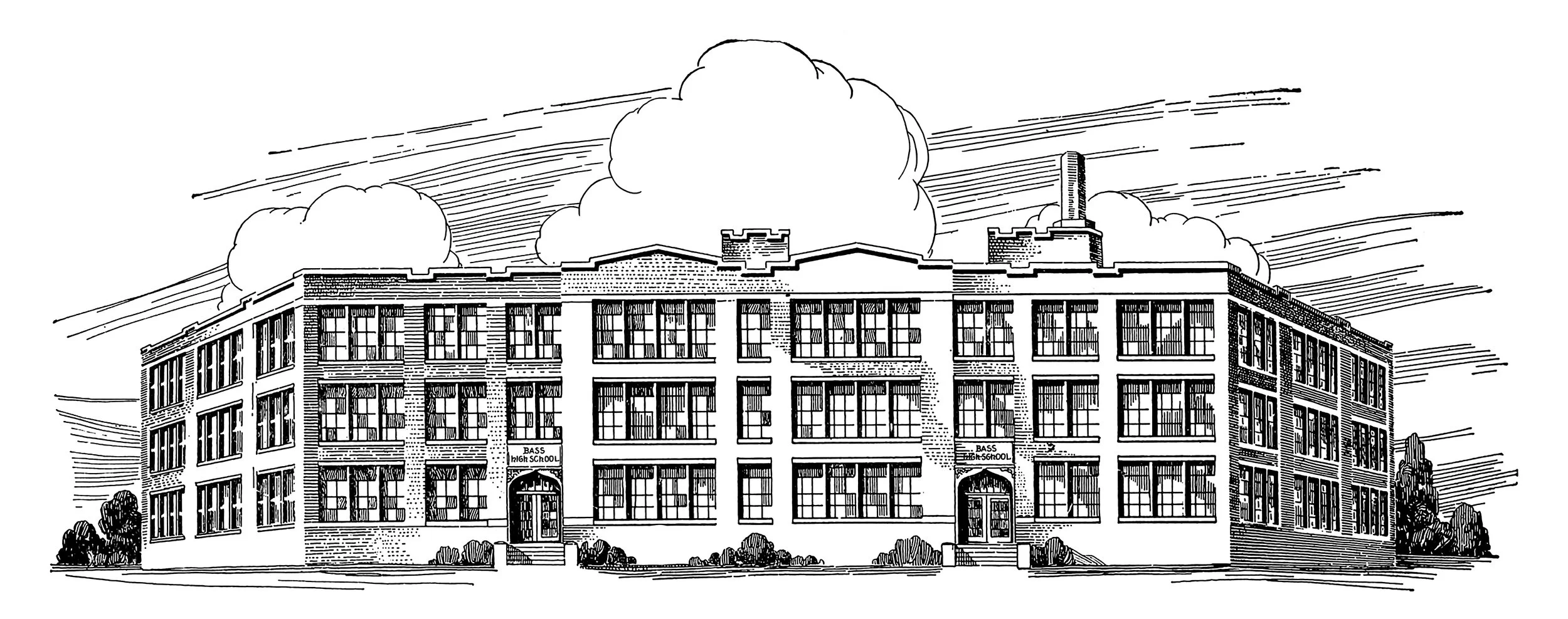
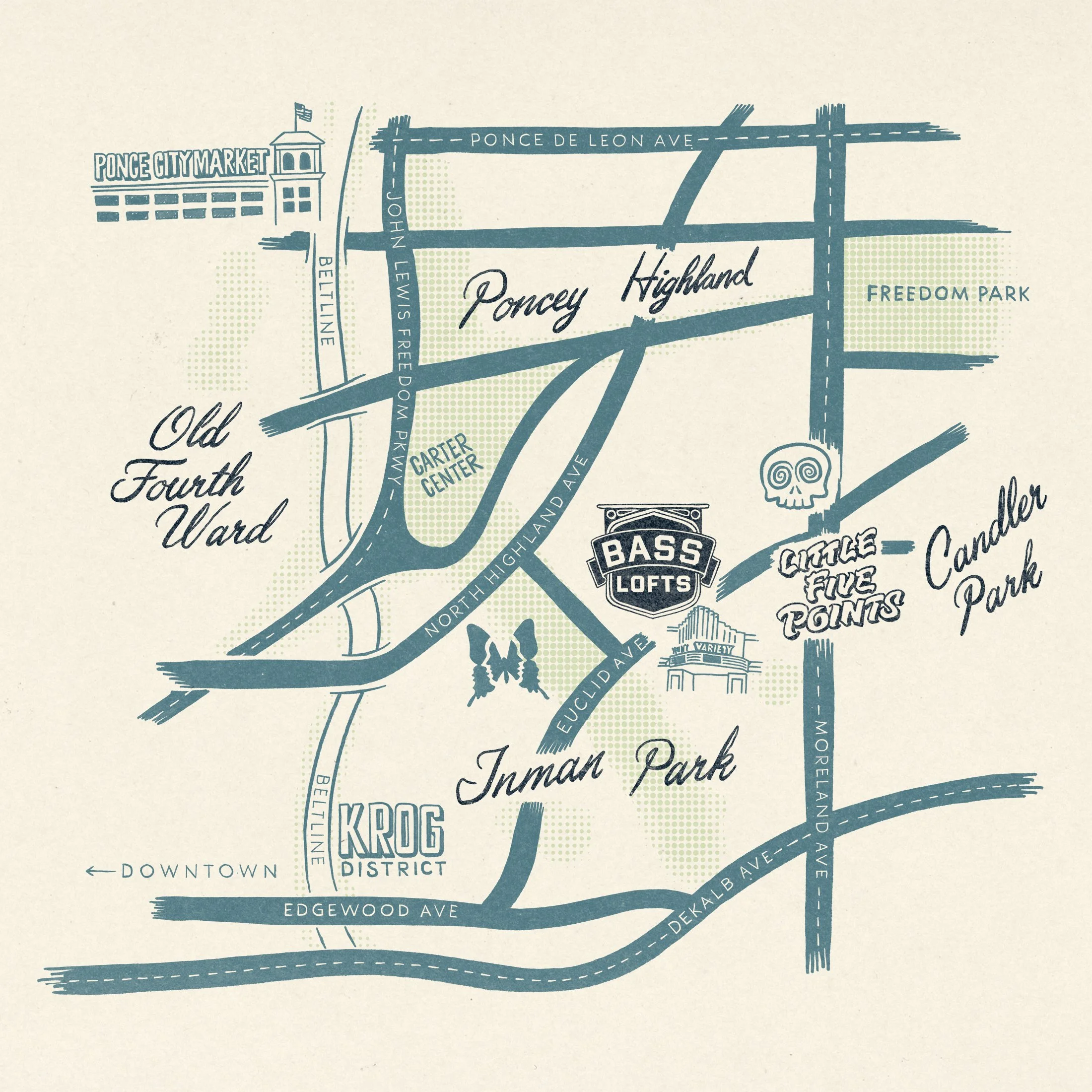
The property sits on a lush seven-acre campus perched on a hilltop between Inman Park and Little Five Points, just minutes from Atlanta’s Beltline. Originally built as a junior high school in 1923 and later operating as Bass High School when it closed in the ’80s, the building was converted to loft apartments in the late 1990s.
Pine Grove Communities acquired the property with plans for much-needed interior renovations and upgrades. While the building itself was already remarkable, with very low turnover and many residents who had lived there for more than a decade, there was a need for an improved, cohesive visual identity. The building and location were clearly beloved, but the lack of a unified brand presented an opportunity: to honor the building’s past while giving it a renewed sense of place and pride for the future.
Design: Studio Delger
Owner: Pine Grove Communities
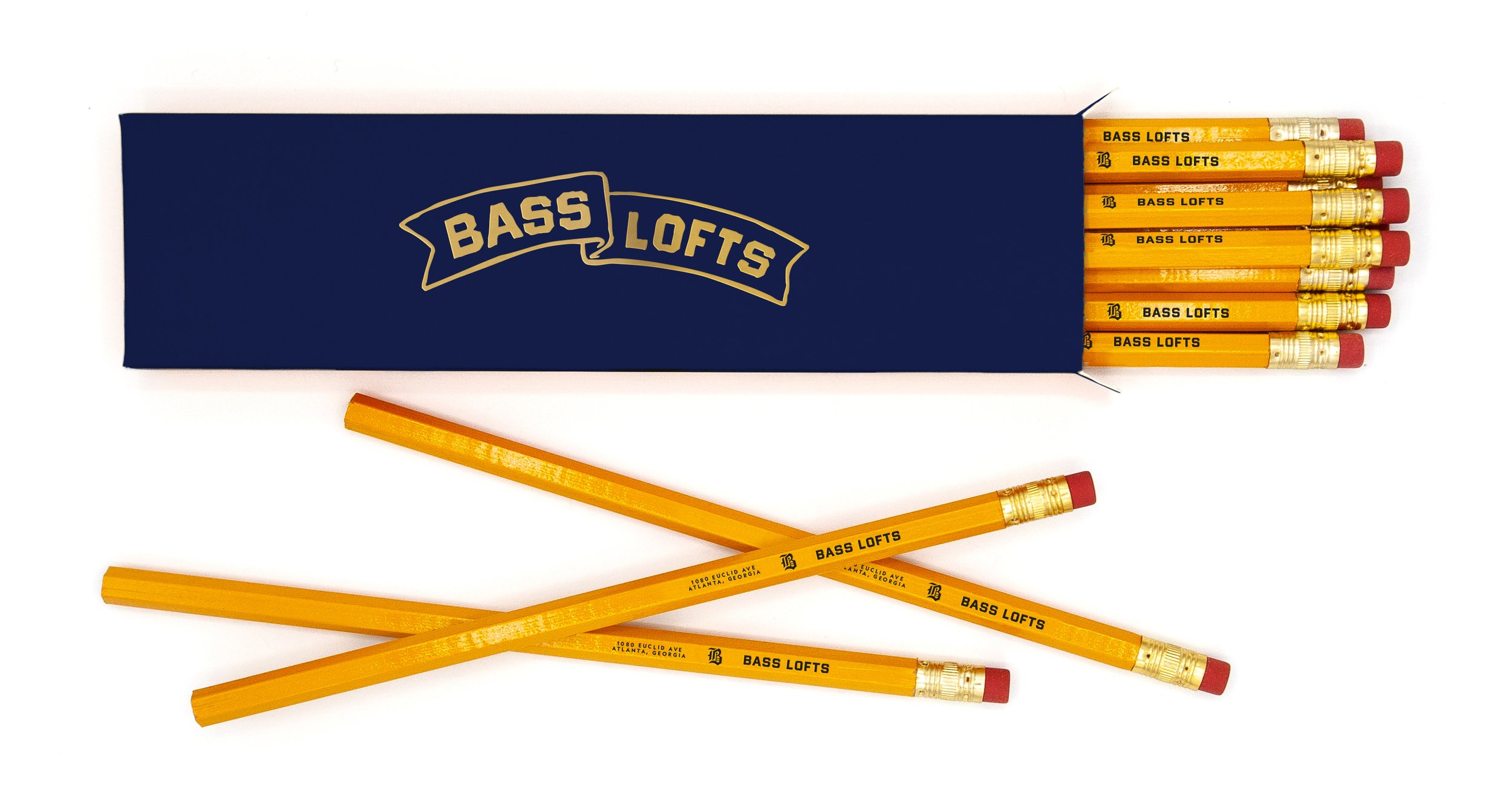
Location: 1080 Euclid Ave. Atlanta, GA 30307
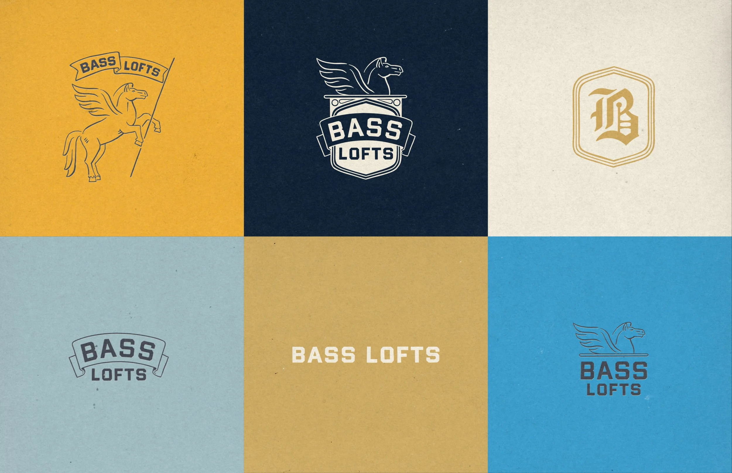
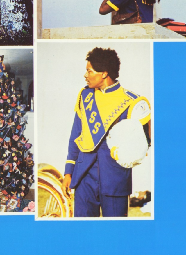
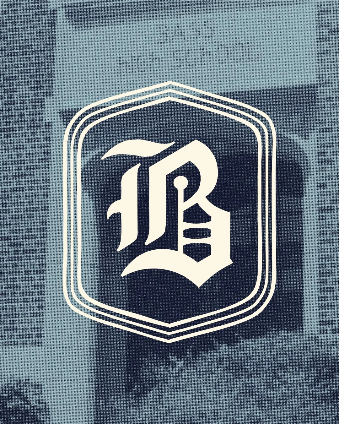
Gothic Revival

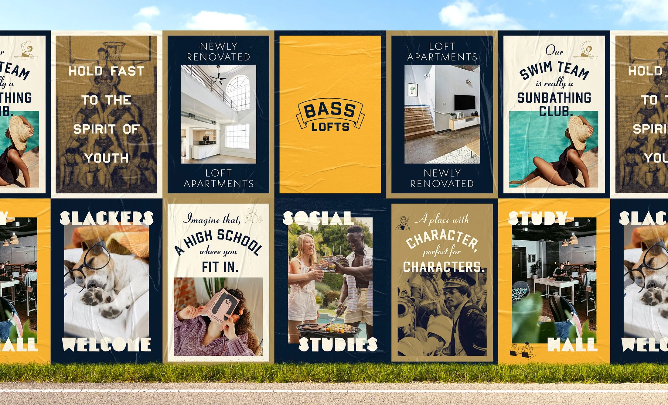
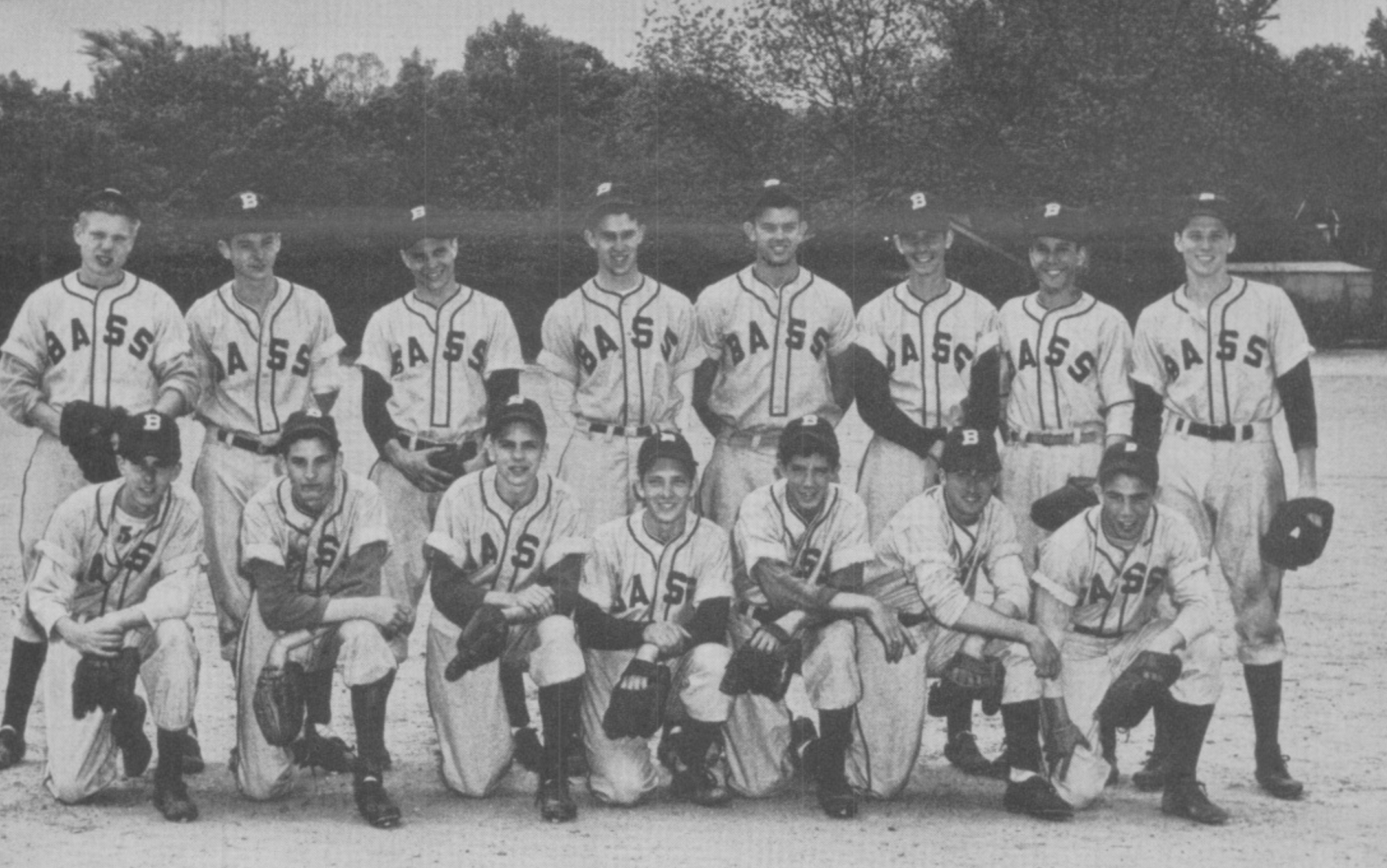
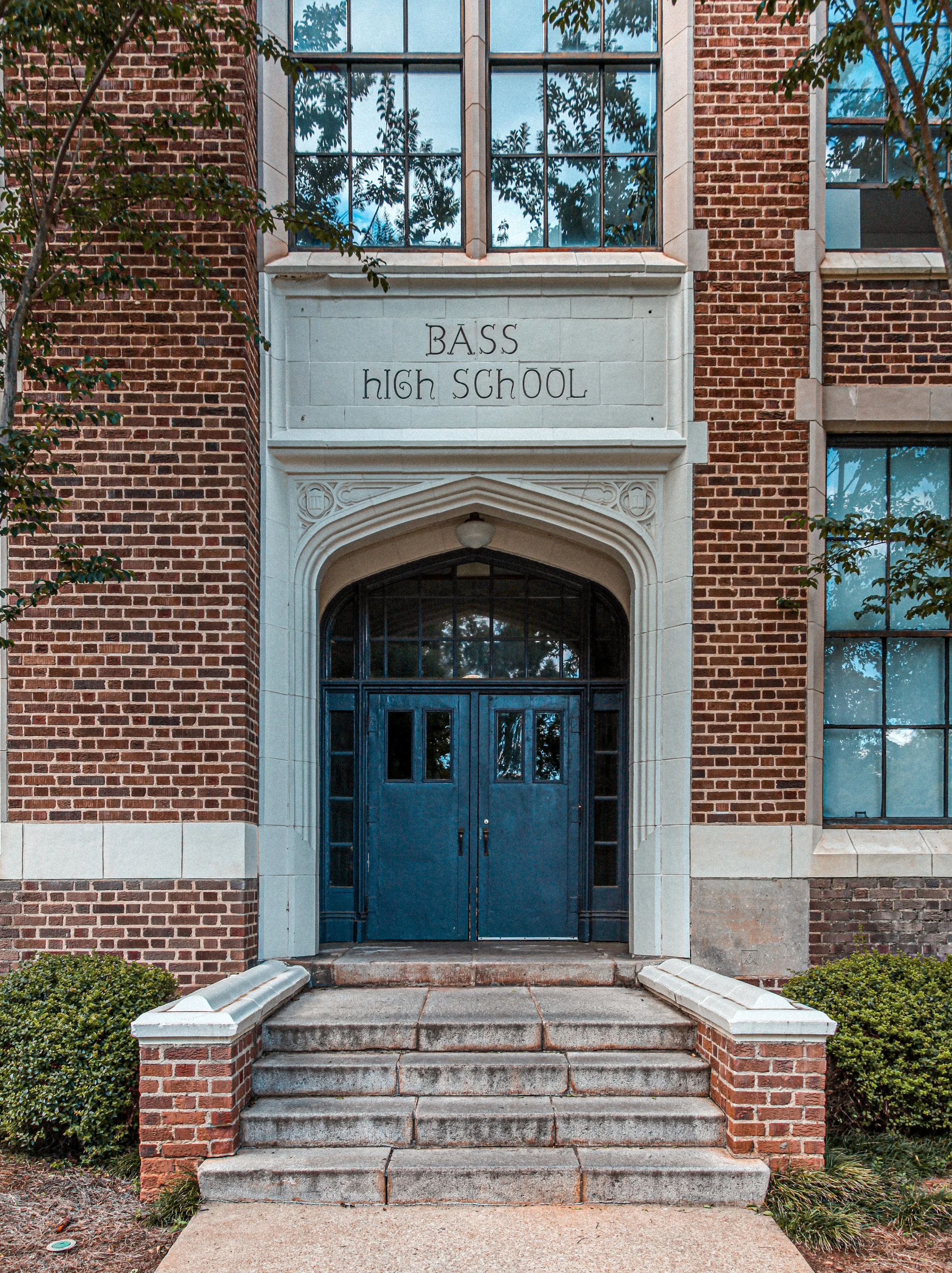
Athletic Aesthetic
Gothic Chenile
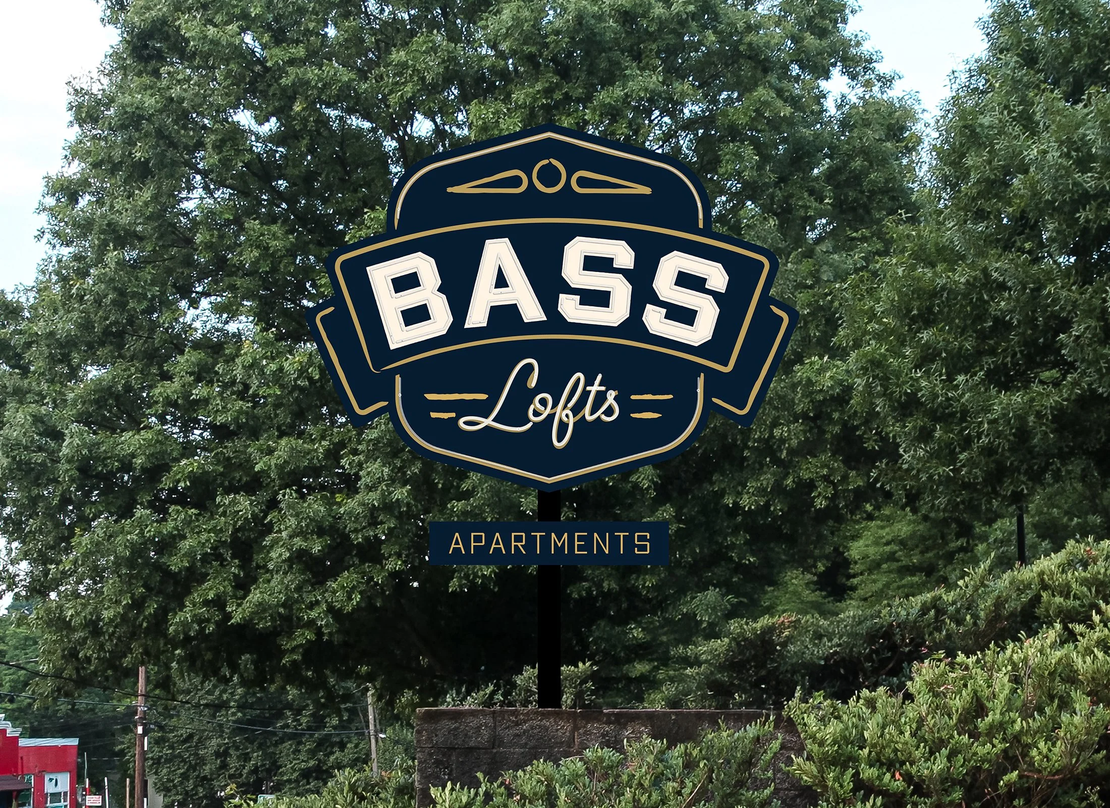
Blues and Golds
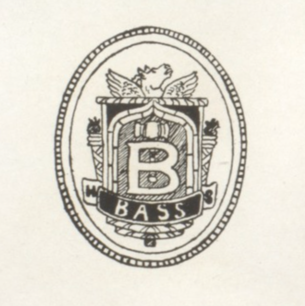
Pegasus Seal
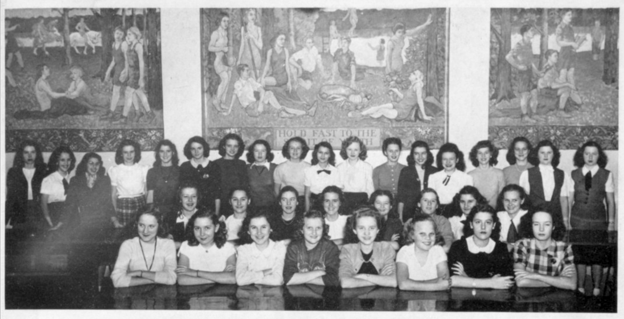
History as a Foundation
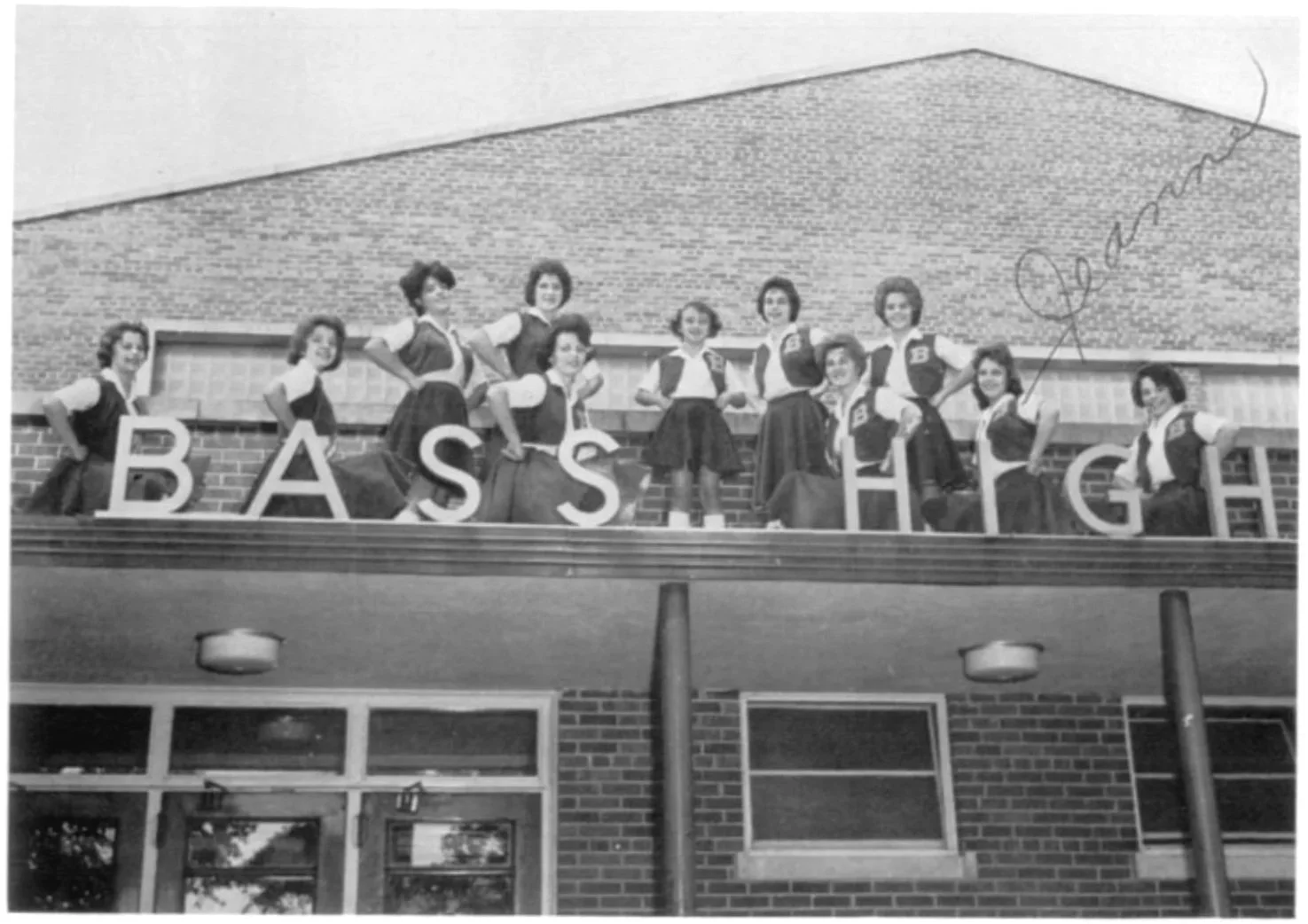
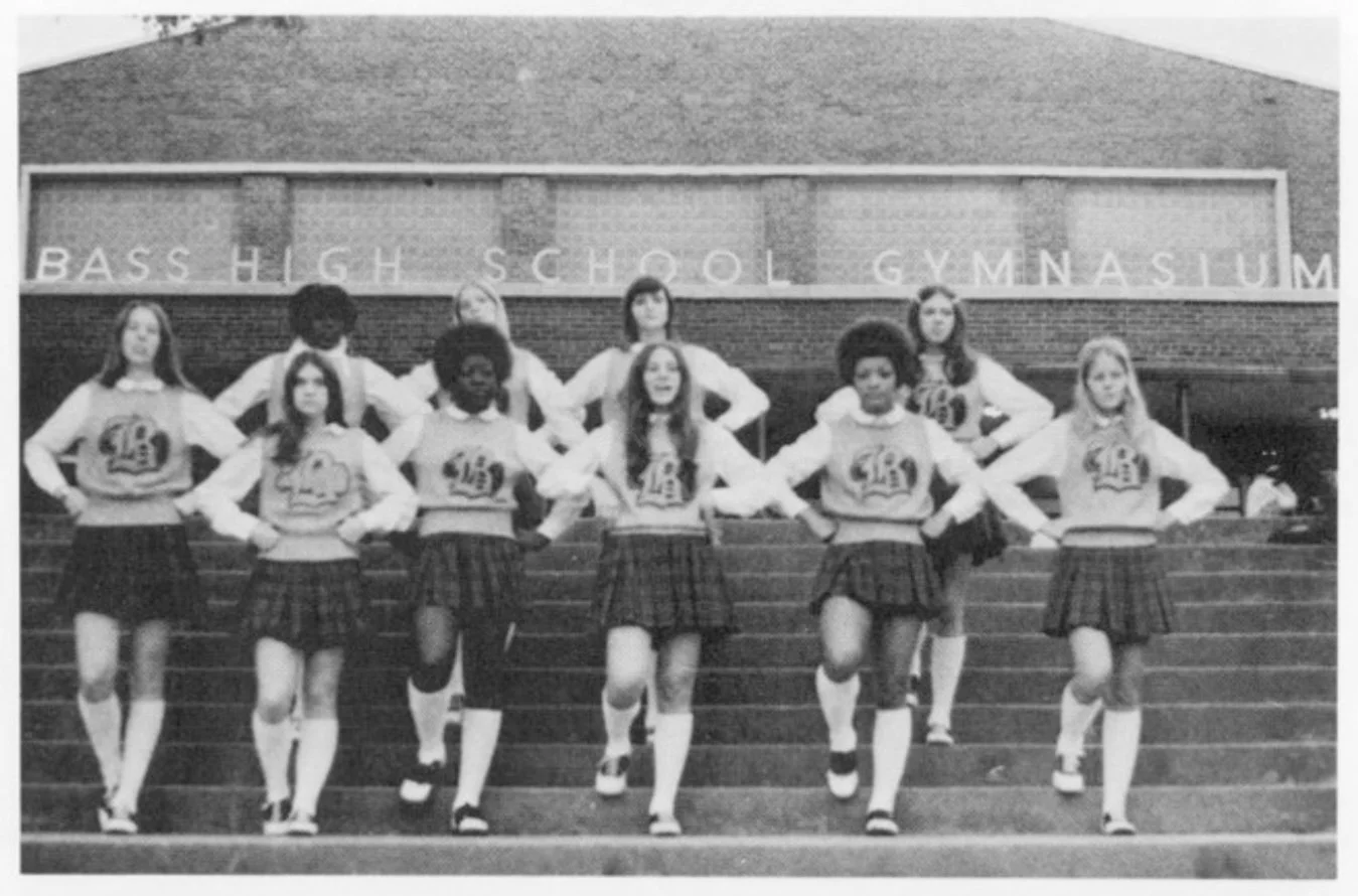
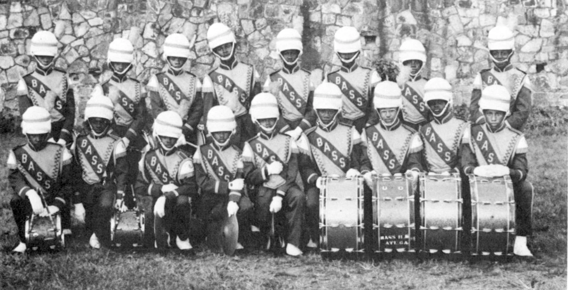
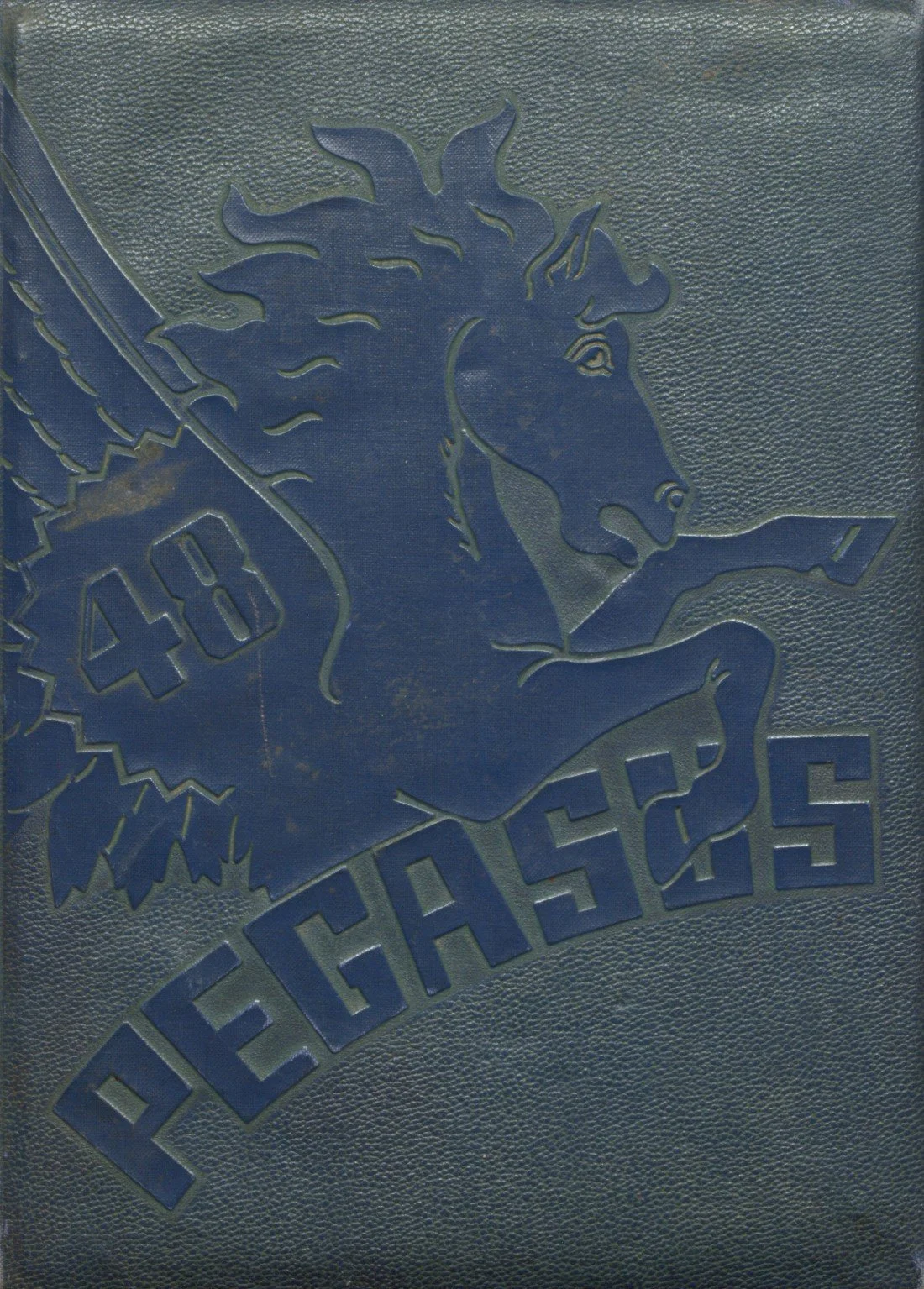
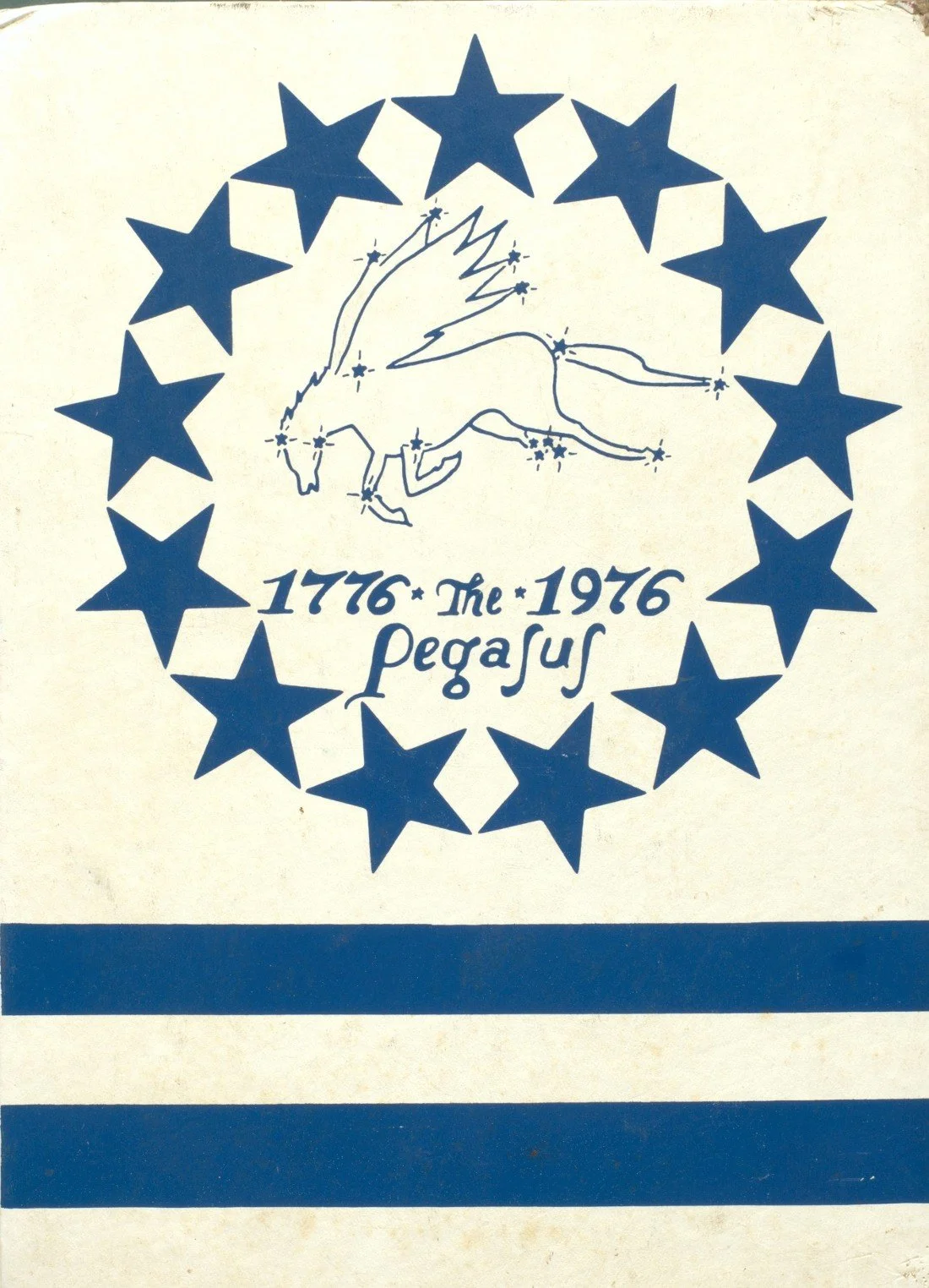
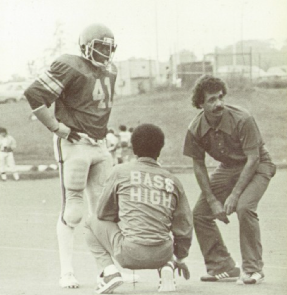
Once again, history informed our creative journey. We jumped at the chance to spend time in old yearbooks, digital archives, and in-person visits to Atlanta’s historic collections.
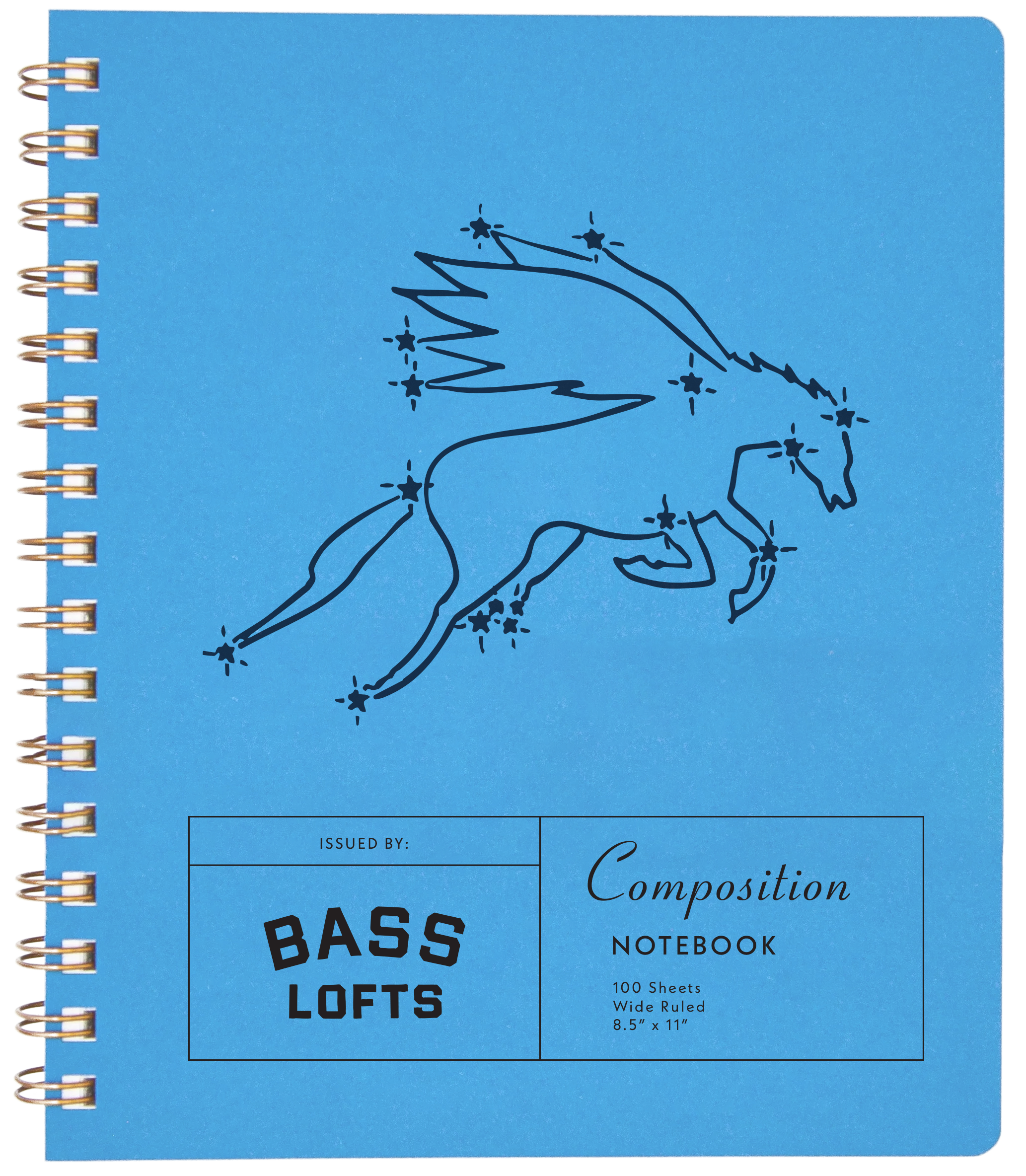
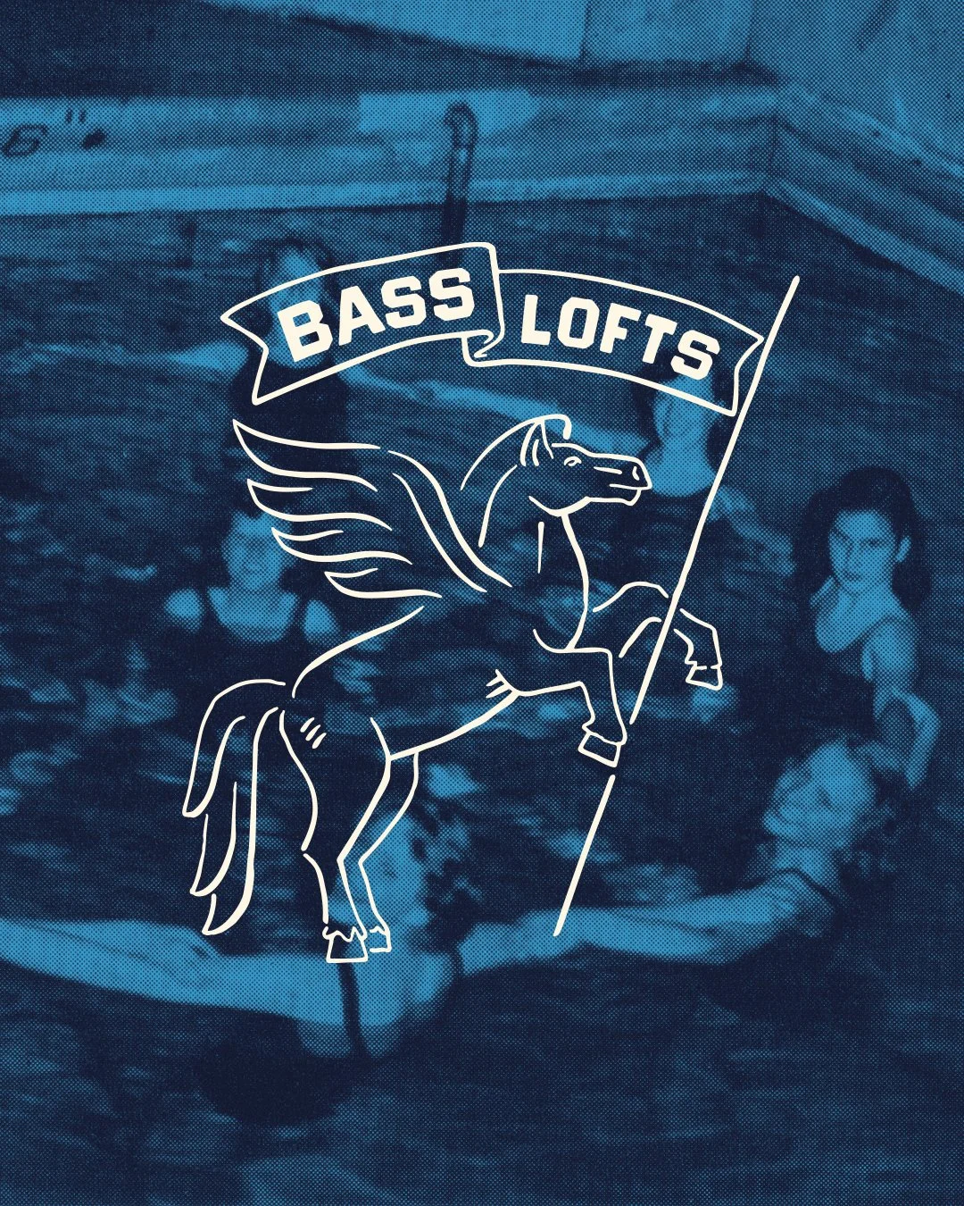
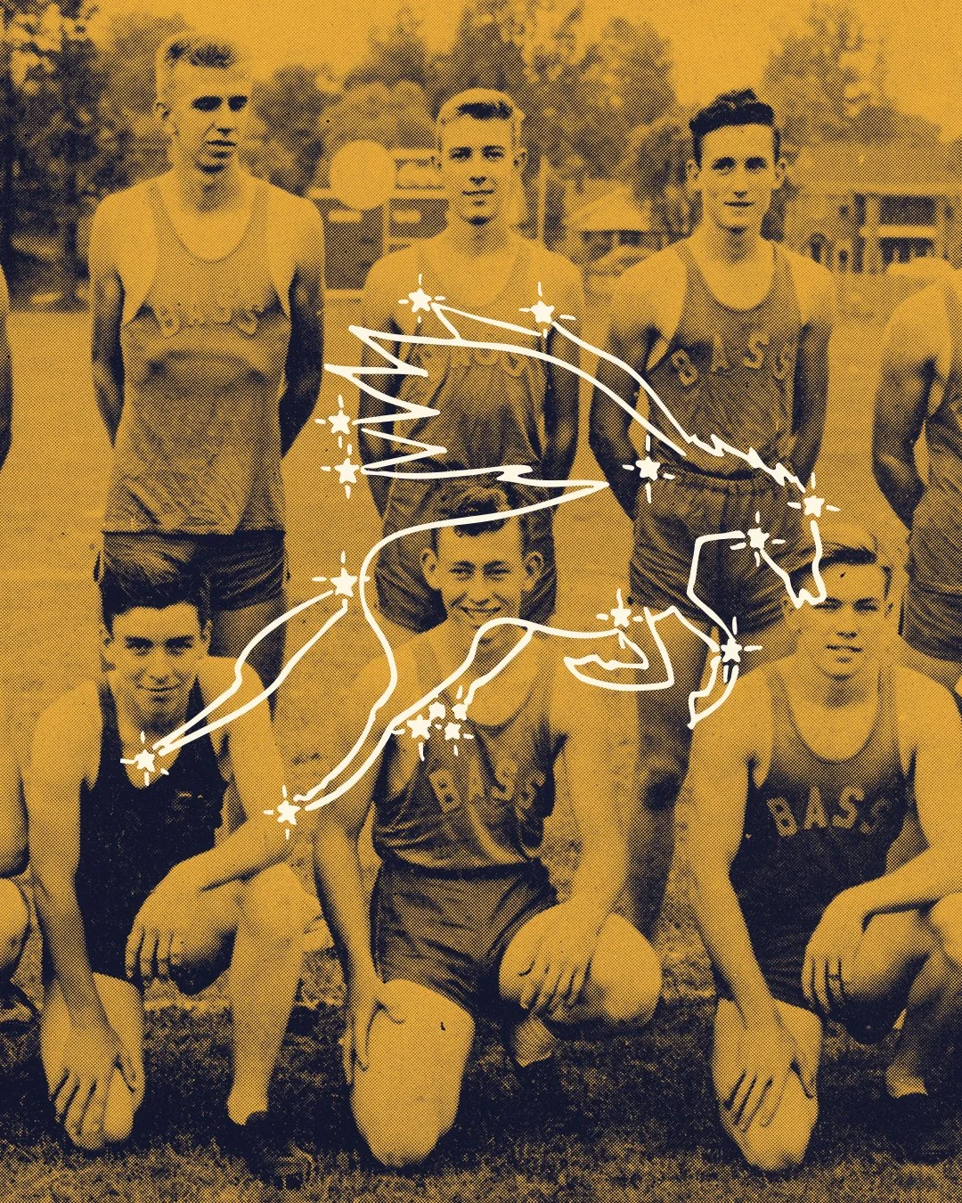
What stood out as a consistent visual was the Pegasus. From the school’s earliest days, the Pegasus appeared in school iconography and its founding mythology, and the yearbook itself was titled The Pegasus throughout the school’s history. Finding a symbol that was both historically rooted and culturally appropriate felt like a gift. In our eyes, the Pegasus became a keeper of stories, continuing the role the yearbooks had played for decades: observing, recording, and carrying the spirit of the place forward. Plus, as a graphic designer, the chance to use a Pegasus in a logo, and have it totally make sense, can’t be overlooked.

Building a visual language
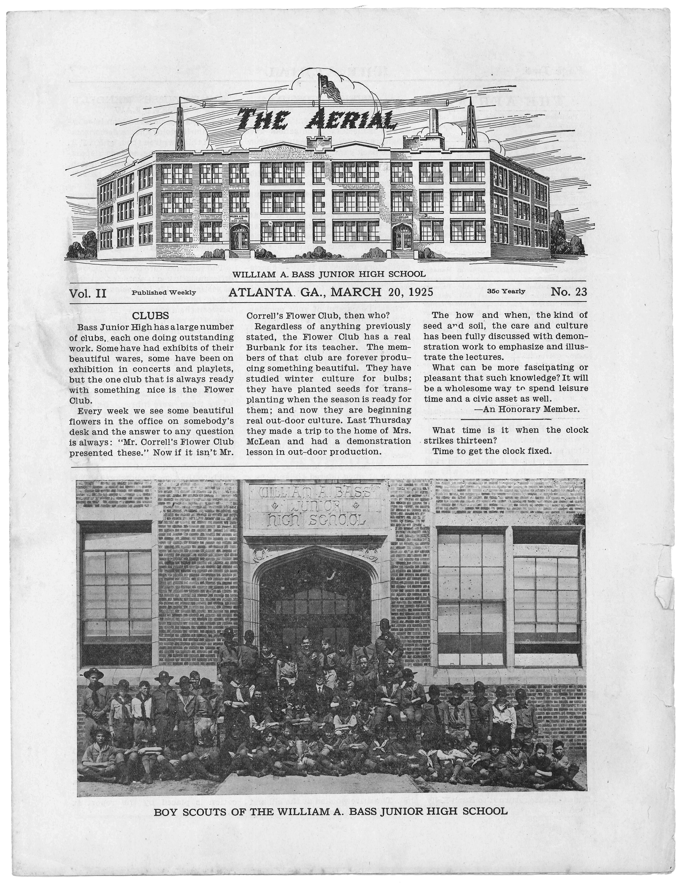
The deeper we went, the more material revealed itself. School newspapers, class assignments, photography, and ephemera helped us assemble a visual archive worth resurfacing.
From this research, we distilled the brand’s personality into four guiding archetypes: the History Teacher, the Class Clown, the Daydreamer, and the Star Student. These archetypes became creative guardrails, grounding decisions while allowing flexibility across the property.
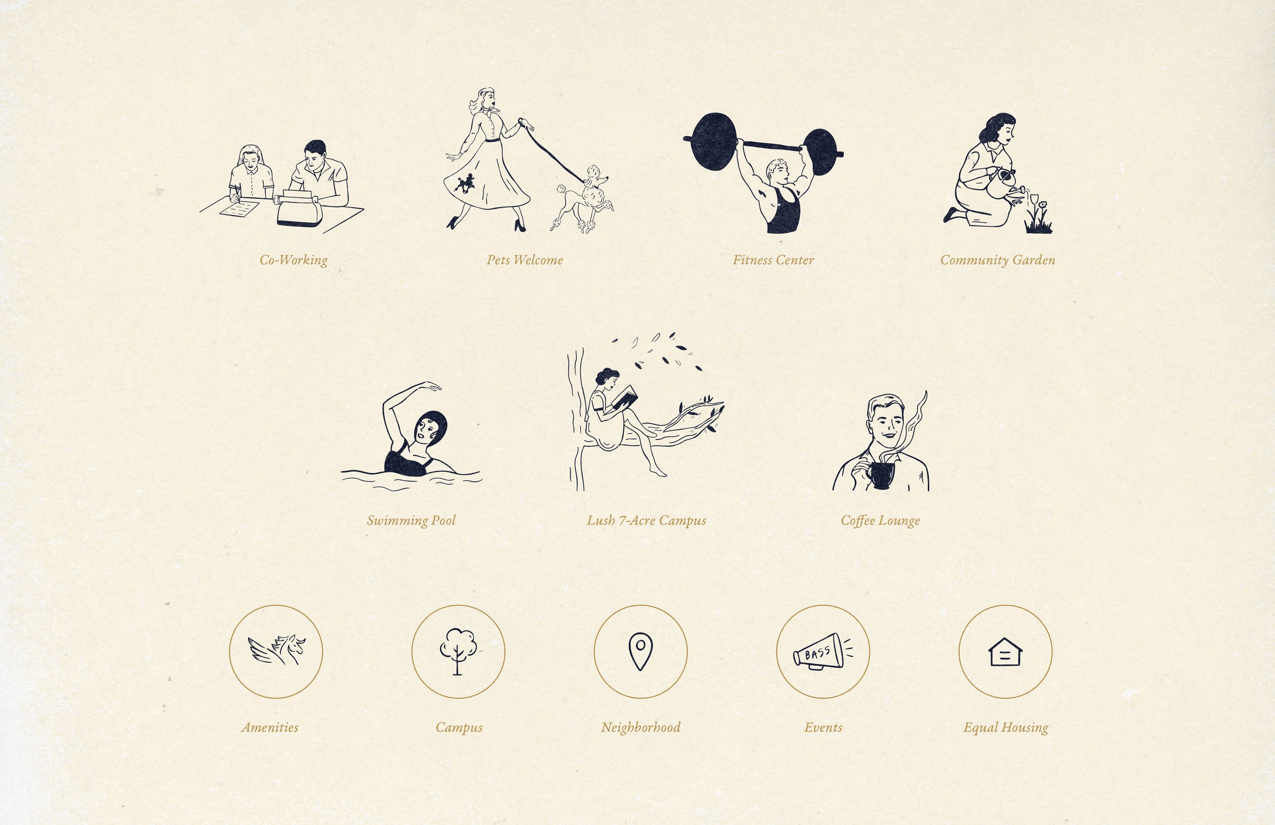
Several visual themes emerged naturally. Academic seals, athletic typography, band and cheer uniforms, and architectural details informed a broader system of graphic elements. Illustrations found in the yearbooks were repurposed and expanded, serving as stylistic inspiration for new, custom icons highlighting modern amenities like the pool, community garden, and fitness center.
Custom Fonts
Bass Paper
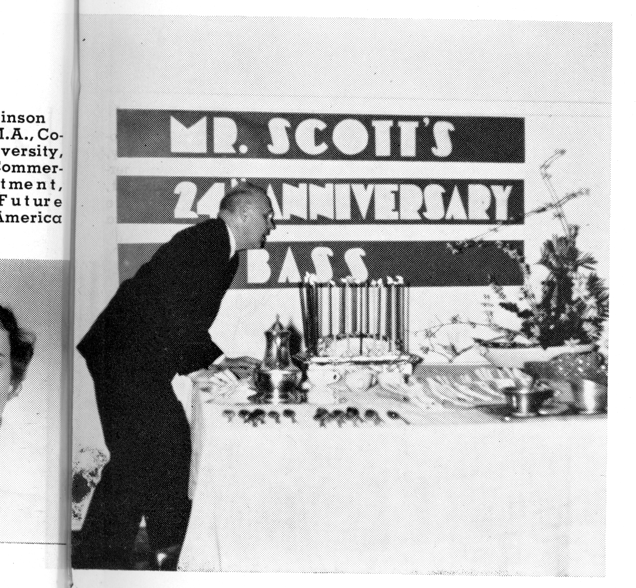
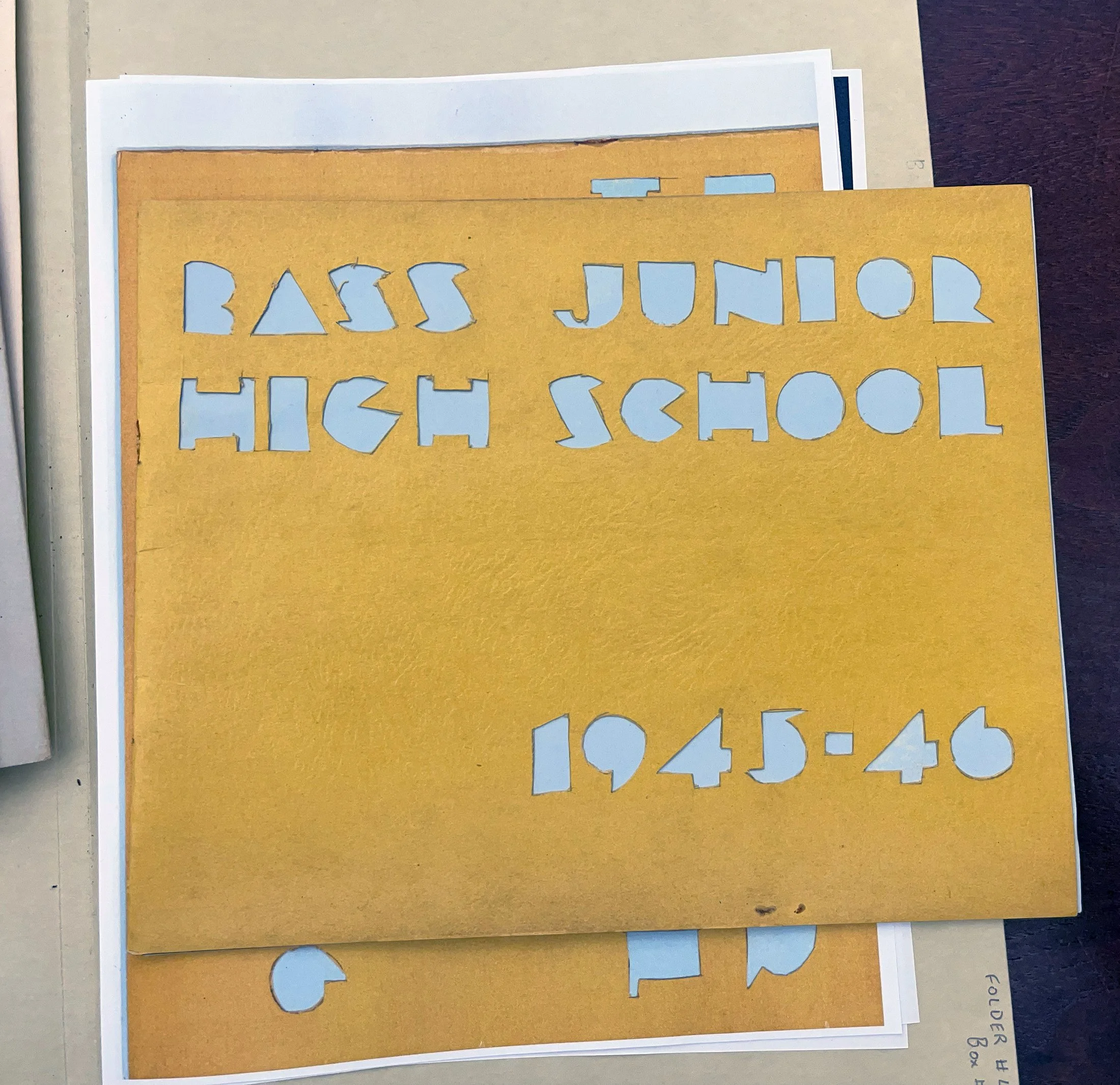
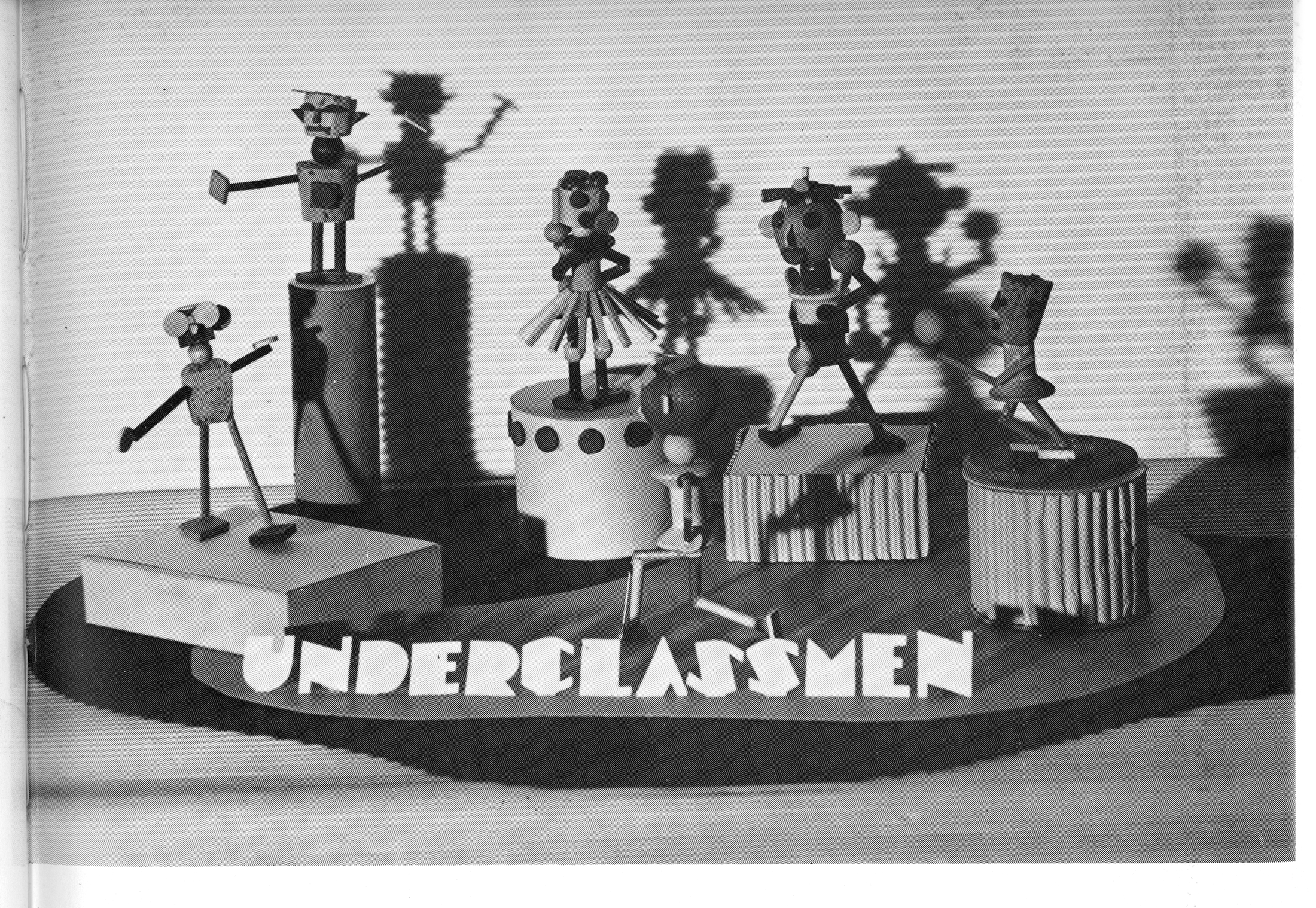
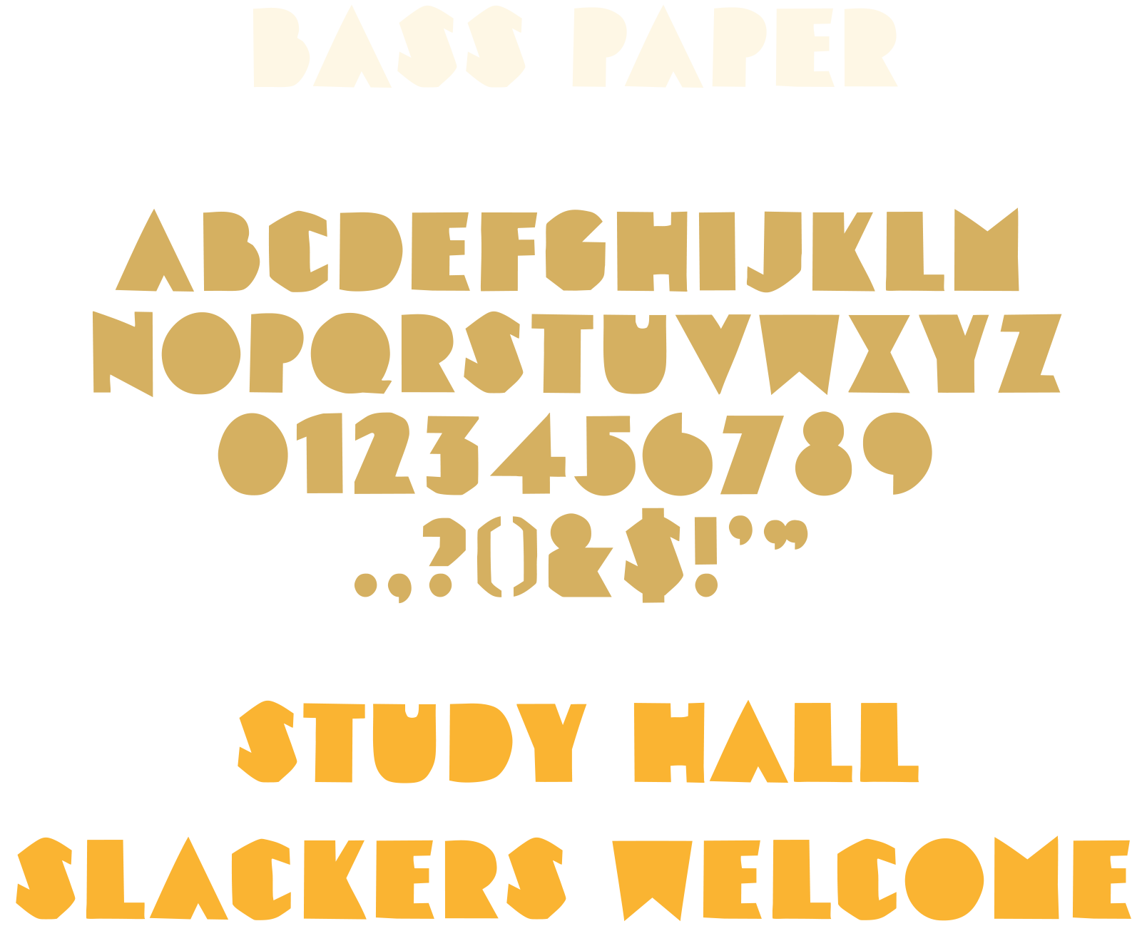
Historic photos and yearbook spreads revealed handmade letters cut from construction paper lining hallways and classrooms. Our best guess is that these were part of a long-running art class exercise, and we loved the idea of carrying that handmade imperfection into the building’s new identity. Bass Paper is a reinterpretation of that style, preserving the charm, unevenness, and warmth of the originals.

Bass Stone
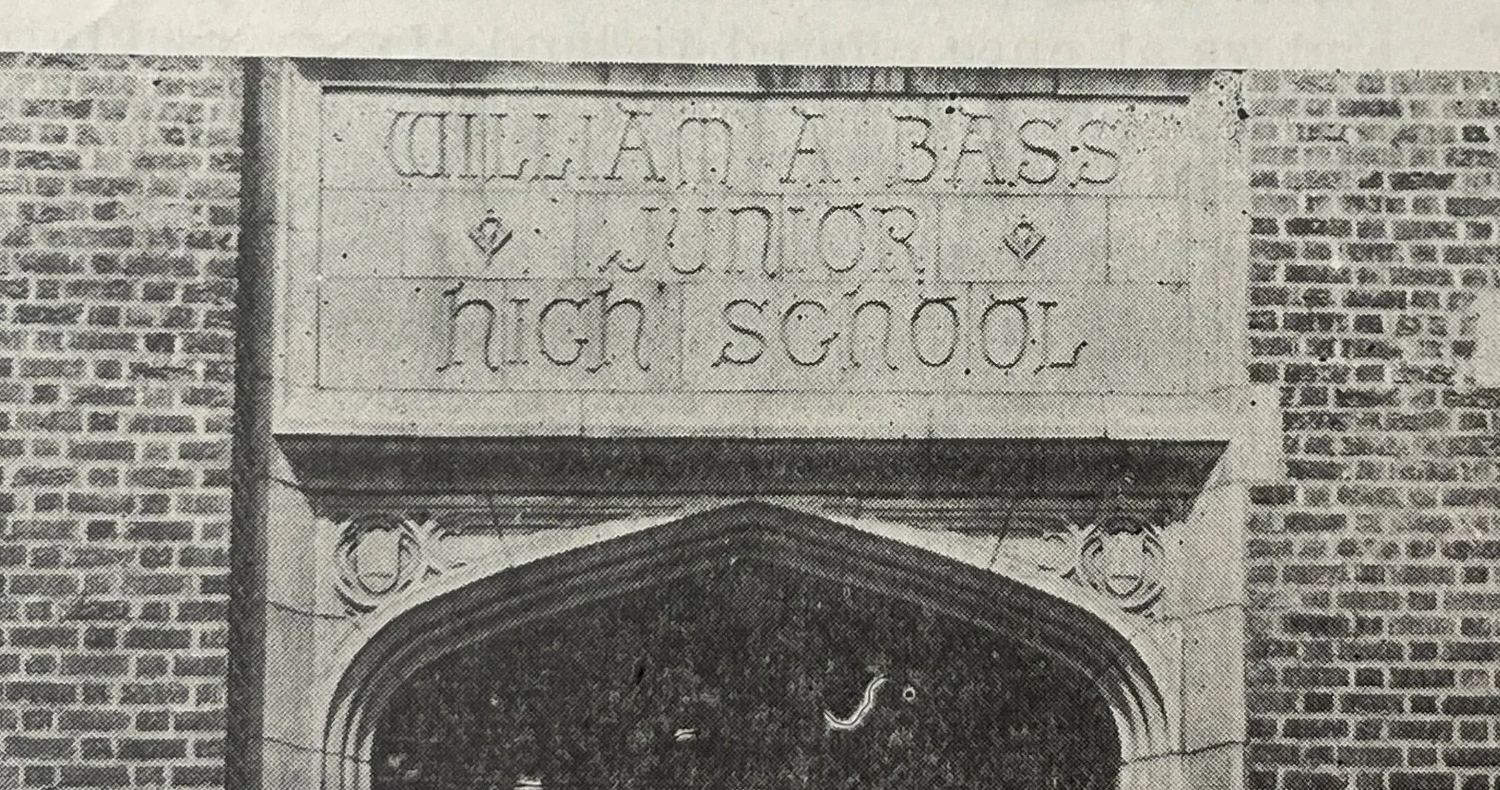
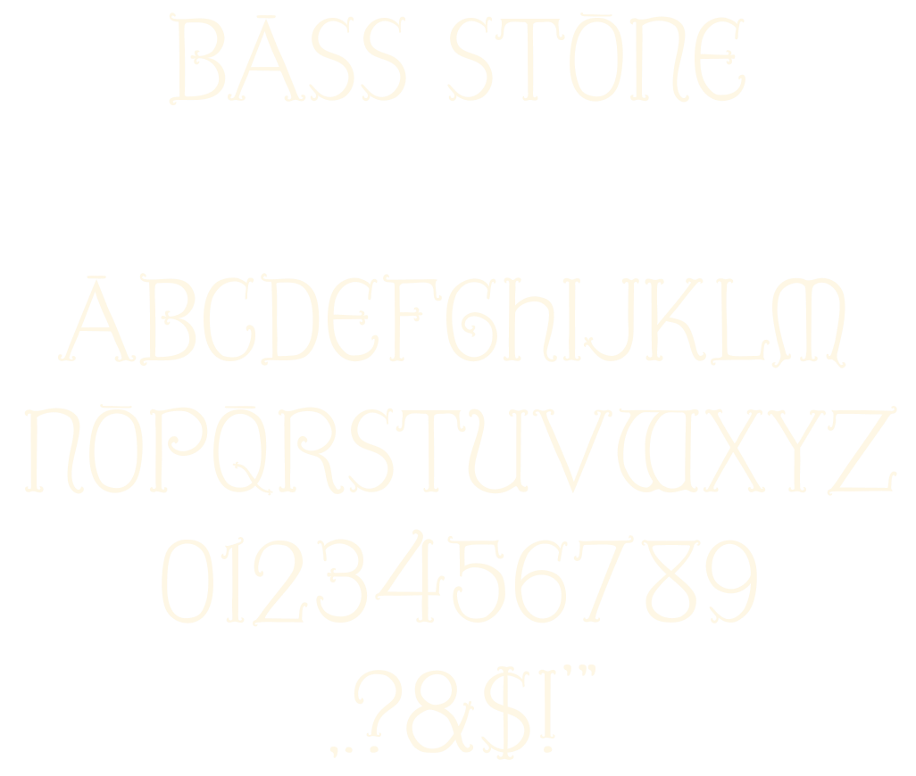
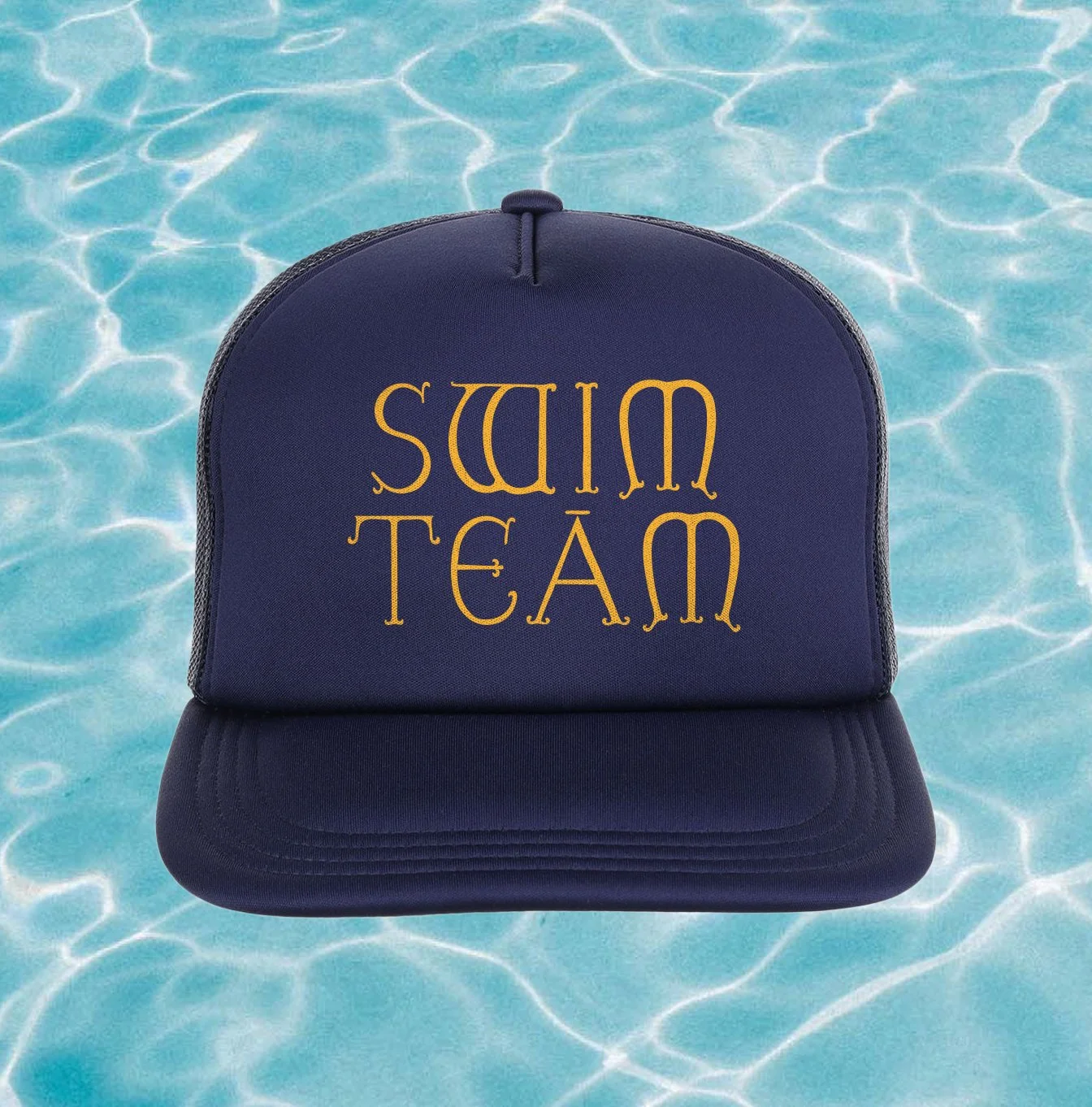
Carved into the stone above the original front door is a second typographic cue: whimsical, slightly offbeat capital letters spelling the school’s name, dating back to its construction in 1923. We revived this lettering as a companion font. It’s capitals only, full of odd proportions and wonky curves, and completely unapologetic.